LAYOUT TIPS

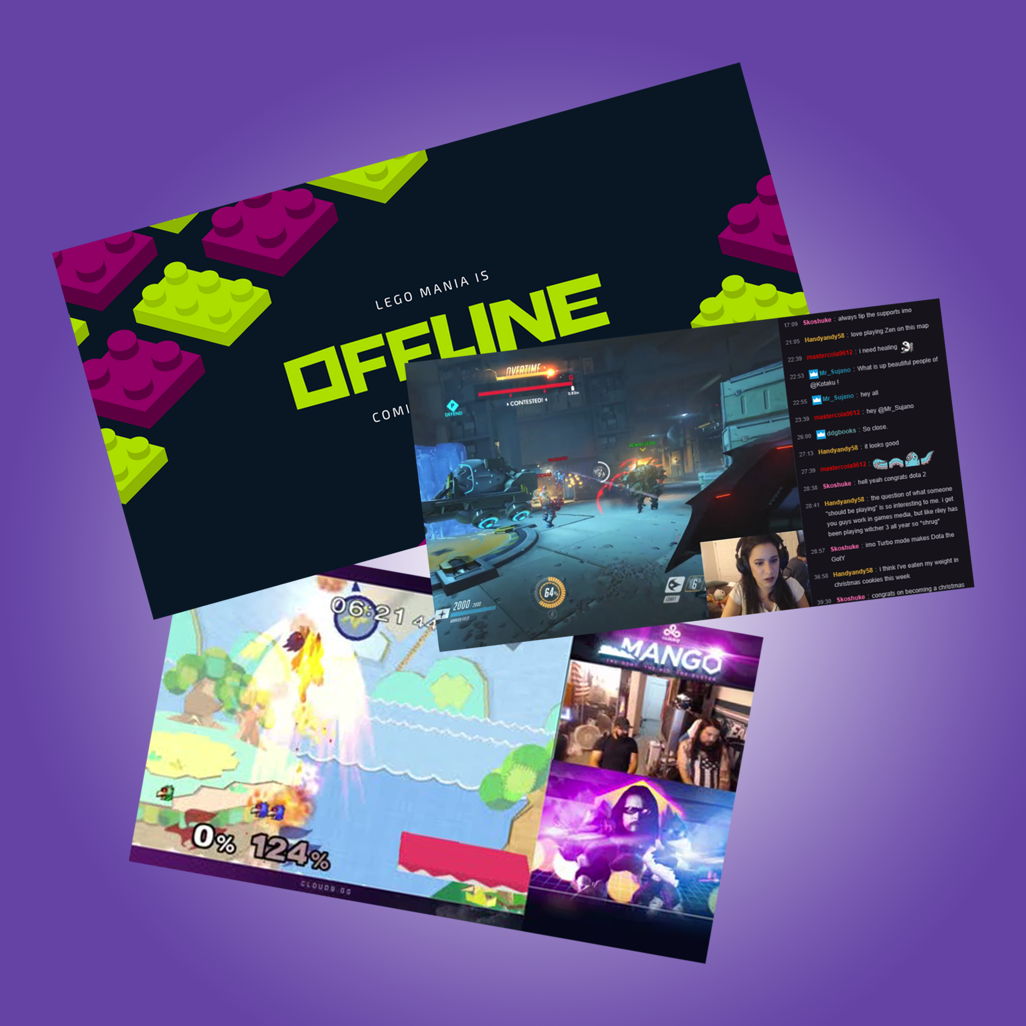
When creating a Twitch layout, there are a few things to keep in mind to create the strongest page. Firstly, proper ratios are important to keep your screen and images looking their best. You also need to determine what about your channel is top priority, and make sure that it’s in the spotlight so that viewers can pay attention to the right things. In most streams, webcams are placed on the far left or right of the screen, with the feed behind, and the chat next to the feed. Bright colors can overwhelm your audience, so it is best to maintain a cooler palette of colors, and as in most design, keeping text to a minimum of one or two harmonious fonts is best. Moving graphics should also be kept to a minimum, to keep focus on the stream, and social media plugs should be present, but not overly so (don’t be tacky). Beyond that, one can focus on the actual video itself; green-screening oneself into a stream works only occasionally, and tilting the screen to add “artificial depth” is to be avoided. Finally, avoid being condescending or generally patronizing with your flavortext; your users will thank you. Reference
Wanna see some examples of what not to do? Check out this twitter feed dedicated to bad Twitch layouts